Styling the app
In the final version of the survey application I will use the Tailwind CSS system to style elements all across the app.
When we set up the project one of the options provided to us automatically was to use Tailwind.
A first example
To show how Tailwind typically gets used in a project, I will start with one component in the project as an example. The SurveyCreator component defined in /app/ui/surveycreator.tsx is a component that implements a form that the user will fill out to create a new survey.
This is what the styled version of the component looks like on the screen.
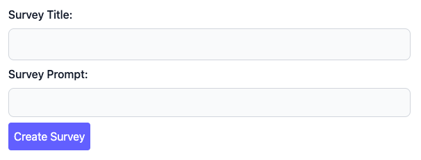
Here is the code for this component. Note that I have added CSS classes to each of the elements in the form:
export default function SurveyCreator({
  adder,
}: {
  adder: (data: FormData) => void;
}) {
  return (
    <form action={adder}>
      <div className="mb-2">
        <label htmlFor="title" className="block mb-2 font-medium text-gray-900">
          Survey Title:
        </label>
        <input
          type="text"
          id="title"
          name="title"
          className="bg-gray-50 border border-gray-300 text-gray-900 rounded-lg block w-full p-2.5"
        />
      </div>
      <div className="mb-2">
        <label
          htmlFor="prompt"
          className="block mb-2 font-medium text-gray-900"
        >
          Survey Prompt:
        </label>
        <input
          type="text"
          name="prompt"
          className="bg-gray-50 border border-gray-300 text-gray-900 rounded-lg block w-full p-2"
        />
      </div>
      <p>
        <button type="submit" className="bg-indigo-500 text-white rounded p-2">
          Create Survey
        </button>
      </p>
    </form>
  );
}
In ordinary HTML we add the class attribute to an element to attach CSS classes to the element. Since the word class is a keyword in the TypeScript language, tsx uses className in place of class for this particular attribute.
In CSS libraries such as Bootstrap, we typically would use a smaller number of specialized classes such as form-label and form-control on form elements. Theses classes control all aspects of the appearance of a particular type of form element.
Tailwind uses a different approach. Tailwind instead offers a large family of utility classes that can be grouped in different combinations to offer more fine-grained control of a particular element. Here is a typical example: the first text input element in the example above uses this list of utility classes:
bg-gray-50 border border-gray-300 text-gray-900 rounded-lg block w-full p-2.5
Here is what each of these utility classes does:
bg-gray-50sets the background of the element to a very light gray color.borderspecifies that the text input element should have a borderborder-gray-300species a light gray color for the bordertext-gray-900specifies that the text that appears in the input element should be drawn with a dark gray colorrounded-lgmakes the border on the element roundedblockspecifies that we should use a block layout for the element. This effectively puts the text input element on its own separate row in the form.w-fullmakes the element take up the full width of its parent form elementp-2.5adds extra padding on all four sides of the text input.
Learning individual classes
To learn Tailwind you are going to learn about a relatively large number of utility classes. To help you do this, I am going to present a brief survey of the most import utility classes below. To make this a little easier I have grouped these utility classes into several broad themes.
Color
CSS is used to apply color to many elements in a page. Tailwind's color system is based on a small number of base colors with variations. To specify a color you use a combination of a color name and a saturation value in the range from 50 to 950. Those colors in turn are used to control text color, background color, and border colors. Tailwind uses distinct class names for each of these three applications.
For example, to specify a color for text you would use a class like
text-indigo-700
To specify a background color you would use
bg-violet-100
To specify a border color you would use
border-cyan-900
Text variations
Tailwind has a very large number of classes to control text.
Two of the most common variants used for text beyond color are text size and weight. To control text size Tailwind uses a range of sizes including sm, base, lg, xl, 2xl, and so on. These sizes control text size via class names like
text-xl
To control the weight of text you use a range of weights including light, normal, medium, and bold to form classes like
font-medium
To control text alignment in paragraphs you use classes such as text-left and text-justify.
Padding and margin
Tailwind utility classes to control padding and margin use a range of sizes in place of the usual CSS measures such as pixels. For example, to apply level 2 padding on all four sides of an element you use
p-2
You can specify separate padding or margin values for individual sides of an element by using the letters t, r, b, and r. For example to apply level 1 margin only to the bottom of an element you use
mb-1
Borders
To put a simple border around an element you can use the class
border
You can control the thickness of a border by attaching a number:
border-2
You can also limit a border to just one side of an element:
border-b-1
Columns
Tailwind makes it easy to set up columns by adding a grid class to a div. You can see an example of this in the QuestionsEditor component in /app/ui/questionseditor.tsx.
export default function QuestionsEditor({
  questions,
  remover,
}: {
  questions: Question[];
  remover: (id: number) => void;
}) {
  return (
    <div>
      {questions.map((q) => {
        return (
          <div className="pb-3 border-b-1 border-indigo-400 grid grid-cols-4 gap-3">
            <div className="col-span-3">
              <QuestionDisplay question={q} />
            </div>
            <div>
              <button
                onClick={() => remover(q.idquestion)}
                className="mt-4 mb-1 bg-red-500 text-white rounded p-2"
              >
                Remove
              </button>
            </div>
          </div>
        );
      })}
    </div>
  );
}
One of the divs here has the classes grid grid-cols-4 gap-3 applied to it. These classes specify that the div's contents should be laid out as a grid, with each child div representing a cell in the grid. The grid will use four columns, and a space of level 3 between the individual columns.
The grid in use here has a two child divs that together will make a single row in the grid. The first child div uses the class col-span-3 to make that div span three of the available 4 columns in the grid. The div that follows will use up the remaining column to make a full row.
The end result is something that looks like this:
