What is Jetpack Compose?
A few years back Meta released the React Framework for web development. That framework proved very influential, and sparked a wave of imitators on other platforms. For mobile programming Apple introduced SwiftUI and Google introduced Jetpack Compose. We will study both of these frameworks in this course.
Our first Jetpack Compose project
To make a Jetpack Compose project in Android Studio, start by clicking the New Project button in the welcome screen in Android Studio.
The first screen you will see will prompt you to select a project type.
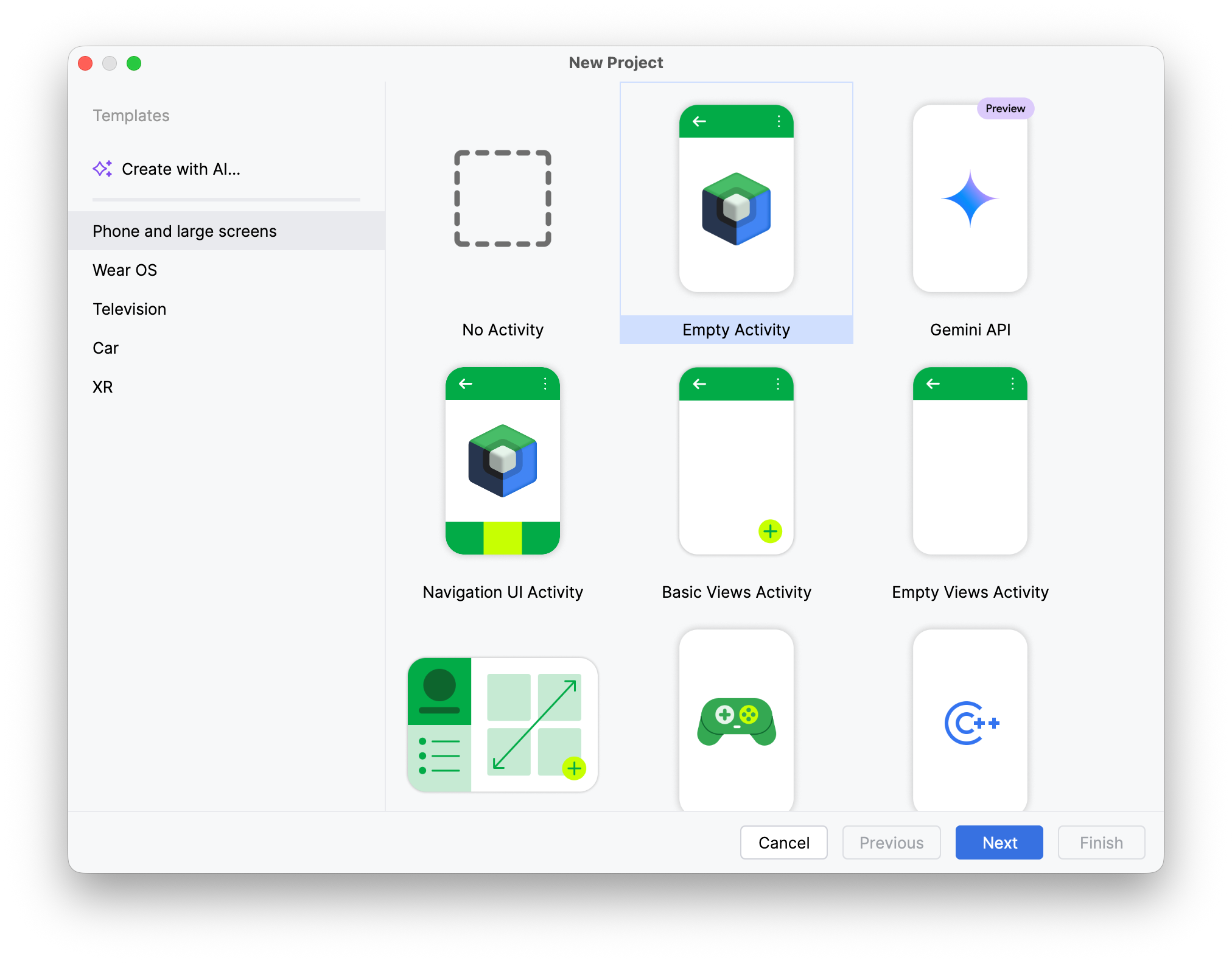
Click on the "Empty Activity" option and click Next.
When you select Empty Activity as the project type Android Studio will automatically default to using Kotlin and Jetpack Compose for your project.
On the next screen enter a name for the project and make a note of the location of the project folder.
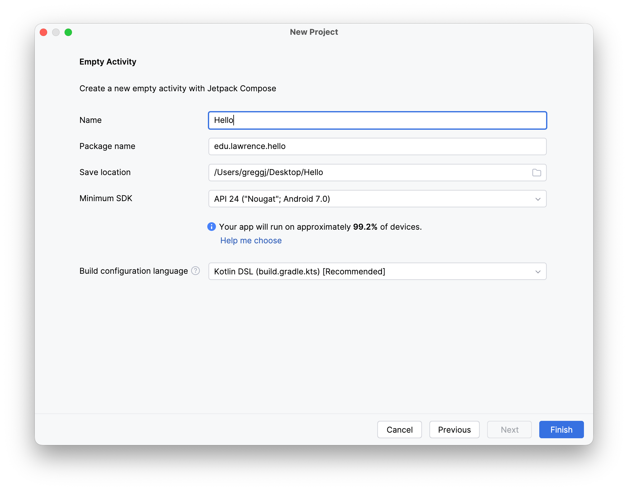
Android Studio will generate some starting code for your project.
package edu.lawrence.hello

import android.os.Bundle
import androidx.activity.ComponentActivity
import androidx.activity.compose.setContent
import androidx.activity.enableEdgeToEdge
import androidx.compose.foundation.layout.fillMaxSize
import androidx.compose.foundation.layout.padding
import androidx.compose.material3.Scaffold
import androidx.compose.material3.Text
import androidx.compose.runtime.Composable
import androidx.compose.ui.Modifier
import androidx.compose.ui.tooling.preview.Preview
import edu.lawrence.hello.ui.theme.HelloTheme

class MainActivity : ComponentActivity() {
    override fun onCreate(savedInstanceState: Bundle?) {
        super.onCreate(savedInstanceState)
        enableEdgeToEdge()
        setContent {
            HelloTheme {
                Scaffold(modifier = Modifier.fillMaxSize()) { innerPadding ->
                    Greeting(
                        name = "Android",
                        modifier = Modifier.padding(innerPadding)
                    )
                }
            }
        }
    }
}

@Composable
fun Greeting(name: String, modifier: Modifier = Modifier) {
    Text(
        text = "Hello $name!",
        modifier = modifier
    )
}

@Preview(showBackground = true)
@Composable
fun GreetingPreview() {
    HelloTheme {
        Greeting("Android")
    }
}
There is a lot going here, but most of the structure you see here will be repeated across each example we see.
The first bit of structure to make note of here is the usual MainActivity class. The difference this time around is the base class: we now use ComponentActivity in place of the previous AppCompatActivity.
All activity classes feature an onCreate() method that is responsible for initializing the activity. The most important thing going on in this version of the onCreate() method is a call to the setContent() method. This method takes a single parameter which a lambda expression that will set up the user interface for the activity. In this code that single parameter gets set up as a trailing lambda expression.
The content for our activity is composed of a nested set of standard elements. The outermost element is a Theme element that is resposible for the overall look and feel of our elements. That theme element is defined in a separate file that Android Studio created for us automatically. The next element in is a Scaffold, which will eventually serve as a container for toolbars and the main content of the view. In this example, the scaffold contains only the main content.
The main content for this simple example is a single composable element that gets defined via its own function further down in the code.
The Greeting function, which sets up the sole element in our user interface, is annotated with @Composable. The purpose of a function that sets up a composable component is to set up and return a set of user inteface elements that will make up that component. This example is very simple, in that a Greeting only contains a single Text() component.
Styling elements
In our next example I am going to keep the basic structure of the previous example and supplement that with some code that modifies the appearance of the text in the Greeting component.
package edu.lawrence.hello

import android.os.Bundle
import androidx.activity.ComponentActivity
import androidx.activity.compose.setContent
import androidx.activity.enableEdgeToEdge
import androidx.compose.foundation.background
import androidx.compose.foundation.layout.Arrangement
import androidx.compose.foundation.layout.Column
import androidx.compose.foundation.layout.fillMaxSize
import androidx.compose.foundation.layout.padding
import androidx.compose.material3.Scaffold
import androidx.compose.material3.Text
import androidx.compose.runtime.Composable
import androidx.compose.ui.Alignment
import androidx.compose.ui.Modifier
import androidx.compose.ui.graphics.Color
import androidx.compose.ui.tooling.preview.Preview
import androidx.compose.ui.unit.dp
import androidx.compose.ui.unit.sp
import edu.lawrence.hello.ui.theme.HelloTheme

class MainActivity : ComponentActivity() {
    override fun onCreate(savedInstanceState: Bundle?) {
        super.onCreate(savedInstanceState)
        enableEdgeToEdge()
        setContent {
            HelloTheme {
                Scaffold(modifier = Modifier.fillMaxSize()) { innerPadding ->
                    Column(verticalArrangement = Arrangement.Center,
                        horizontalAlignment = Alignment.CenterHorizontally,
                        modifier=Modifier.padding(innerPadding).fillMaxSize()) {
                        Greeting(
                            name = "Android",
                            modifier = Modifier.background(color= Color.Green).padding(24.dp)
                        )
                    }
                }
            }
        }
    }
}

@Composable
fun Greeting(name: String, modifier: Modifier = Modifier) {
    Text(
        text = "Hello $name!",
        fontSize = 48.sp,
        modifier = modifier
    )
}

@Preview(showBackground = true)
@Composable
fun GreetingPreview() {
    HelloTheme {
        Greeting("Android",
            Modifier.background(color= Color.Green).padding(24.dp))
    }
}
I have applied a number of changes here to modify the look and feel of the view.
- I wrapped the
Greeting()component in aColumn()component. I did this because theColumn()component allows me to specify how to arrange the elements in the column. In this case, I added code to tell the column to center its content vertically in the view and horizontally in the view. - In setting up the Text() component in the Greeting(), I applied some extra parameters to the constructor. The
fontSizeparameter allows me to specify what font size to use for the text, while themodifierparameter allows me to control other aspects of the appearance of the text. - The modifier parameter of the
Text()component expects me to pass it a Modifer object. You can see that Modifier being set up in the call to theGreeting()function. The Modifer I used specifies that the text should be rendered with a background color of green and 24 pixels of extra padding.
Here is further documentation on how to style text and the basics of modifiers in Jetpack Compose.
Implementing interactivity
For our last example today I am going to construct a simple "Hello, World" application in Jetpack Compose that includes several elements in the user interface, including a button with an associated action.
Here is the complete code for that example.
package edu.lawrence.hello

import android.os.Bundle
import androidx.activity.ComponentActivity
import androidx.activity.compose.setContent
import androidx.activity.enableEdgeToEdge
import androidx.compose.foundation.background
import androidx.compose.foundation.layout.Arrangement
import androidx.compose.foundation.layout.Column
import androidx.compose.foundation.layout.Spacer
import androidx.compose.foundation.layout.fillMaxSize
import androidx.compose.foundation.layout.height
import androidx.compose.foundation.layout.padding
import androidx.compose.material3.Button
import androidx.compose.material3.Scaffold
import androidx.compose.material3.Text
import androidx.compose.runtime.Composable
import androidx.compose.runtime.mutableStateOf
import androidx.compose.runtime.remember
import androidx.compose.ui.Alignment
import androidx.compose.ui.Modifier
import androidx.compose.ui.graphics.Color
import androidx.compose.ui.tooling.preview.Preview
import androidx.compose.ui.unit.dp
import androidx.compose.ui.unit.sp
import edu.lawrence.hello.ui.theme.HelloTheme

class MainActivity : ComponentActivity() {
    override fun onCreate(savedInstanceState: Bundle?) {
        super.onCreate(savedInstanceState)
        enableEdgeToEdge()
        setContent {
            HelloTheme {
                Scaffold(modifier = Modifier.fillMaxSize()) { innerPadding ->
                    Column(verticalArrangement = Arrangement.Center,
                        horizontalAlignment = Alignment.CenterHorizontally,
                        modifier=Modifier.padding(innerPadding).fillMaxSize()) {
                        Greeting()
                    }
                }
            }
        }
    }
}

@Composable
fun Greeting() {
    val greeting = remember { mutableStateOf("")}
    Button(onClick={ greeting.value = "Hello, Android!"}) {
        Text("Greet Me!")
    }
    Spacer(modifier = Modifier.height(20.dp))
    Text(
        text = greeting.value,
        fontSize = 48.sp,
        modifier = Modifier.background(color= Color.Green).padding(24.dp)
    )
}


@Preview(showBackground = true)
@Composable
fun GreetingPreview() {
    HelloTheme {
        Greeting()
    }
}
This example is the first to make use of a state variable. In Jetpack Compose we set up state variables by setting up local variables in a component function that are initialized via the special remember() function. A state variable stores what is known as observable object. Jetpack compose will watch this object for changes, and whenever it sees that the value of the observable object has changed it will rerender the component to display the updated state of the state variable. Values of observable objects have to be initialized via calls to special mutable state constructor functions.
Buttons in the Jetpack Compose need to have both an onClick callback function and a body. In most cases the body of a button will be some text that button displays. In this example the callback function that I passed to the button changes the value of the state variable. This in turn will force the Greeting component to be rerendered to display the new value of the greeting in the Text component below the button.
In this example the Greeting component now consists of three sub-components, a button, a spacer, and some text.