The More Components App
Our next example is an app that will demonstrate how to use a number of Jetpack Compose components that we have not had a chance to cover so far in this course.
Tabbed Navigation
The first new feature that this app demonstrates is a new type of navigation using a tabbed interface. At the bottom of the app you will see a set of three icons - these allow us to navigate easily between three screens by simply tapping the icon for the screen we want.
This navigation structure gets set up in the TabApp component, which is the top level component for our app:
@Composable
fun TabApp() {
    val navController = rememberNavController()

    Scaffold(bottomBar = {
        BottomAppBar(
            actions = {
                IconButton(onClick = { navController.navigate("form") }) {
                    Icon(Icons.Filled.Edit,
                        contentDescription = "Form Demo")
                }
                IconButton(onClick = { navController.navigate("dialog") }) {
                    Icon(Icons.Filled.Check,
                        contentDescription = "Dialog Demo")
                }
                IconButton(onClick = { navController.navigate("photo")}) {
                    Icon(Icons.Filled.AccountBox,
                        contentDescription = "Photo Demo")
                }
            }
        )
    },
        modifier = Modifier.fillMaxSize()) { innerPadding ->
        NavHost(navController,startDestination="form") {
            composable(route="form") {
                FormScreen(modifier = Modifier.padding(innerPadding))
            }
            composable(route="dialog") {
                DialogScreen(modifier = Modifier.padding(innerPadding))
            }
            composable(route="photo") {
                PhotoScreen(modifier = Modifier.padding(innerPadding))
            }
        }
    }
}
The magic here is a combination of a Scaffold with a BottomAppBar and a NavHost to set up our navigation routes.
The BottomAppBar has an actions section that contains a list of three IconButtons. The onClick parameter for each IconButton holds code that tells the navController to navigate to an appropriate route.
The Form Demo
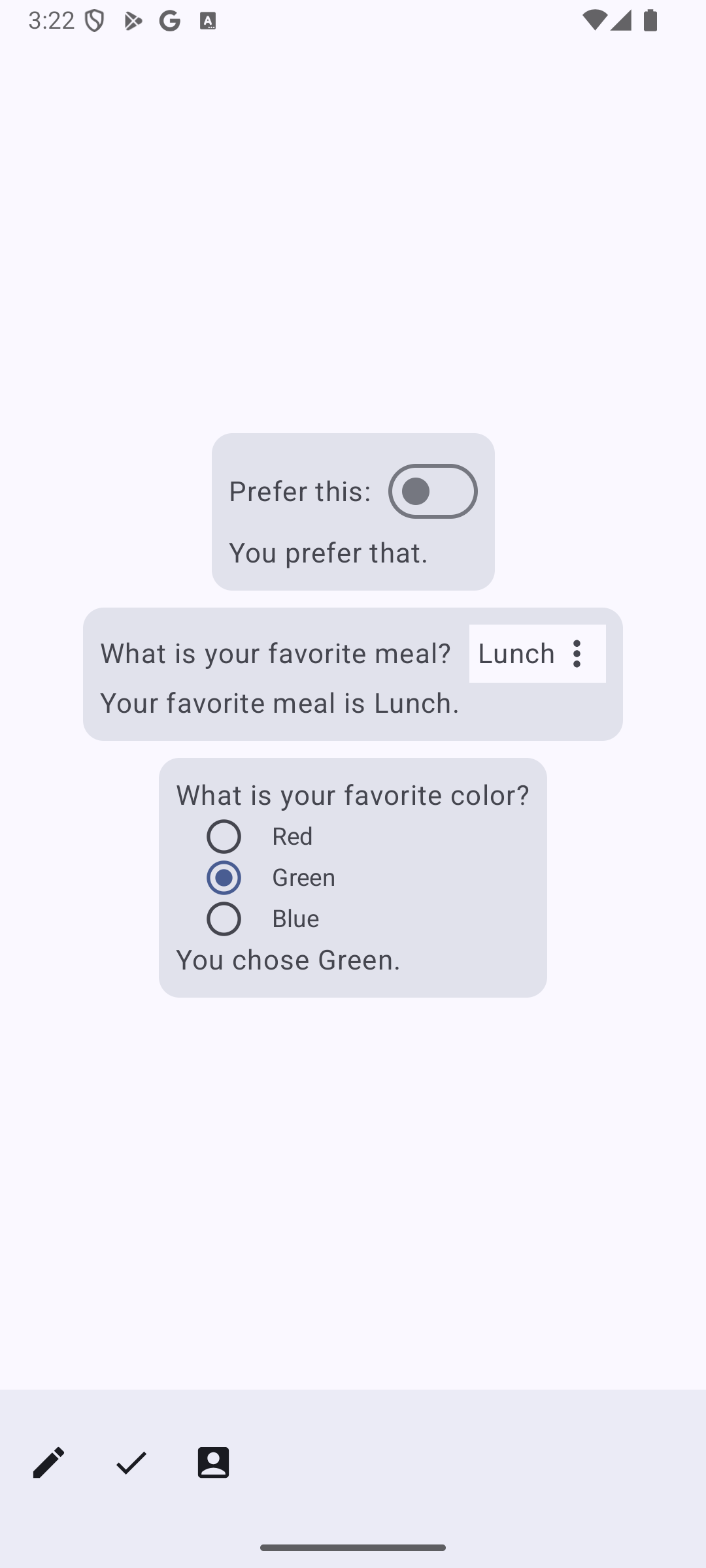
The first of the three screens in our example app demonstrates the use some input components we haven't had a chance to work with.
Here is the code for that screen:
@Composable
fun FormScreen(modifier : Modifier) {
    val toggleState = remember { mutableStateOf(false) }
    val meals = listOf("Breakfast","Lunch","Dinner")
    val favoriteMeal = remember { mutableStateOf(meals[1]) }
    val colors = listOf("Red","Green","Blue")
    val favoriteColor = remember { mutableStateOf(colors[1])}

    Column(verticalArrangement = Arrangement.Center,horizontalAlignment = Alignment.CenterHorizontally, modifier = modifier.fillMaxSize().padding(10.dp)) {
        Card() {
            Column(modifier = Modifier.padding(10.dp)) {
                Row(
                    horizontalArrangement = Arrangement.Start,
                    verticalAlignment = Alignment.CenterVertically
                ) {
                    Text("Prefer this:")
                    Spacer(modifier = Modifier.width(10.dp))
                    Switch(
                        checked = toggleState.value,
                        onCheckedChange = { toggleState.value = it })
                }
                if (toggleState.value)
                    Text("You prefer this.")
                else
                    Text("You prefer that.")
            }
        }
        Spacer(modifier=Modifier.height(10.dp))
        Card() {
            Column(modifier = Modifier.padding(10.dp)) {
                Row(
                    horizontalArrangement = Arrangement.Start,
                    verticalAlignment = Alignment.CenterVertically,
                ) {
                    Text("What is your favorite meal?")
                    Spacer(modifier = Modifier.width(10.dp))
                    TextMenu(meals,meals[1],{favoriteMeal.value = it})
                }
                Text("Your favorite meal is ${favoriteMeal.value}.")
            }
        }
        Spacer(modifier=Modifier.height(10.dp))
        Card() {
            Column(Modifier.padding(10.dp).selectableGroup()) {
                Text("What is your favorite color?")
                colors.forEach { color ->
                    Row(
                        Modifier.selectable(
                                selected = (color == favoriteColor.value),
                                onClick = { favoriteColor.value = color },
                                role = Role.RadioButton
                            )
                            .padding(horizontal = 16.dp),
                        verticalAlignment = Alignment.CenterVertically
                    ) {
                        RadioButton(
                            selected = (color == favoriteColor.value),
                            onClick = null
                        )
                        Text(
                            text = color,
                            style = MaterialTheme.typography.bodyMedium,
                            modifier = Modifier.padding(start = 16.dp)
                        )
                    }
                }
                Text("You chose ${favoriteColor.value}.")
            }
        }

    }
}
The first thing to notice here is the use of Card() components, which act as containers for distinct portions of the screen.
Mixed in with all of this code you will see examples of three new user interface components, the Switch(), the drop down menu, and the RadioButton().
Switch() implements a simple two position toggle switch. To use it we link it to a simple boolean state variable, toggleState:
Switch(checked = toggleState.value,
   onCheckedChange = { toggleState.value = it })
Because drop down menus are pretty tricky to implement in Android, I have broken the code for the drop down menu out into its own component:
@Composable
fun TextMenu(choices : List<String>,default : String,onChoice : (String)->Unit) {
    val expanded = remember { mutableStateOf(false) }
    val selected = remember { mutableStateOf(default) }
    Column() {
        Row(
            modifier = Modifier.background(color = MaterialTheme.colorScheme.background).padding(5.dp)
                .clickable(onClick = { expanded.value = !expanded.value })
        ) {
            Text(selected.value)
            Icon(
                imageVector = Icons.Default.MoreVert,
                contentDescription = "More"
            )
        }
        DropdownMenu(
            expanded = expanded.value,
            onDismissRequest = { expanded.value = false }
        ) {
            choices.forEach { choice ->
                DropdownMenuItem(text = { Text(choice) },
                    onClick = {
                        selected.value = choice
                        expanded.value = false
                        onChoice(choice)
                    })
            }
        }
    }
}
The purpose of this component is to set up a drop down menu that displays a list of strings as possible choices. In addition, the caller has to indicate which of the choices is selected at start along with a callback function that we will invoke whenever the user makes a new choice from the menu.
The drop down menu is a combination of two parts. The first part is a Text() element and an Icon() that display the user's current choice. These will be visible on screen. When the user clicks on this first part the second part, which is the full menu of choices, appears on the screen.
The menu is implemented via a DropdownMenu() component. To control whether or not that menu is displayed we use a state variable, expanded. The body of the component is where we set up the list of options for the menu in the usual forEach construct. We set up each option in the menu via a DropdownMenuItem() component that allows to configure the text for the option and a callback that will be invoked when the user clicks on an item.
Notice that the code in callback updates the selected state variable, which controls what text the first part of our component displays, and then calls the onChoice() callback function that was passed down to us with the new selection.
The final thing this screen demonstrates is setting up radio buttons and putting them into a radio group. In a radio group only one radio button at a time can be selected. Getting all of this set up successfully is a complicated interplay between three components: a Column() to bound the radio group, a Row() for entry in the group, and the RadioButton component itself. Here is the relevant section of the code:
Column(Modifier.padding(10.dp).selectableGroup()) {
    Text("What is your favorite color?")
    colors.forEach { color ->
        Row(Modifier.selectable(
            selected = (color == favoriteColor.value),
            onClick = { favoriteColor.value = color },
            role = Role.RadioButton
            ).padding(horizontal = 16.dp),
            verticalAlignment = Alignment.CenterVertically
            )
        {
            RadioButton(
                selected = (color == favoriteColor.value),
                onClick = null
            )
            Text(
                text = color,
                style = MaterialTheme.typography.bodyMedium,
                modifier = Modifier.padding(start = 16.dp)
            )
         }
    }
    Text("You chose ${favoriteColor.value}.")
}
The first special thing we have to do here is to use a special selectableGroup() modifier on the column. This allows the column to function as a group for the radio buttons inside it. Next, we put each radio button in a row along with its text label and apply a special selectable() modifier to the row. That modifier has three parameters that determine whether or not a row is selected, what to do when the user clicks the row, and a role parameter that specifies that we are working with radio buttons. Finally, the RadioButton itself simply will need some logic to determine whether to draw itself in the selected state as a filled circle or in the unselected state as an empty circle.
Dialogs
The second screen in the application demonstrates the use of alerts and dialogs.
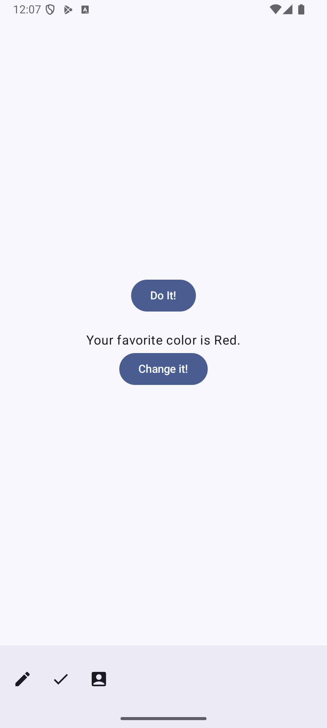
Here is the code for this screen:
@Composable
fun DialogScreen(modifier : Modifier) {
    val done = remember { mutableStateOf(false) }
    val openAlert = remember { mutableStateOf(false) }
    val colors = listOf("Red","Green","Blue")
    val favoriteColor = remember { mutableStateOf(colors[0]) }
    val openDialog = remember { mutableStateOf(false) }

    Column(verticalArrangement = Arrangement.Center,horizontalAlignment = Alignment.CenterHorizontally, modifier = modifier.fillMaxSize().padding(10.dp)) {
        if(done.value) {
            Text("You did it.")
        } else {
            Button(onClick = { openAlert.value = true }) {
                Text("Do It!")
            }
        }
        if (openAlert.value) {
            AlertDialog(
                onDismissRequest = {
                    openAlert.value = false
                },
                title = { Text(text = "Are you sure?") },
                text = { Text(text = "Are you sure you want to do it?") },
                confirmButton = {
                    TextButton(onClick = {
                        openAlert.value = false
                        done.value = true
                    }) { Text("Confirm") }
                },
                dismissButton = {
                    TextButton(onClick = { openAlert.value = false }) { Text("Dismiss") }
                }
            )
        }
        Spacer(modifier = Modifier.height(20.dp))
        Text("Your favorite color is ${favoriteColor.value}.")
        Button(onClick = { openDialog.value = true }) {
            Text("Change it!")
        }
        if(openDialog.value) {
            DialogWithChoice(choices = colors,
                onConfirmation = {
                    favoriteColor.value = it
                    openDialog.value = false
                },
                onDismissRequest = {
                    openDialog.value = false
                })
        }
    }
}
The two components to focus on here are AlertDialog() and DialogWithChoice(). AlertDialog() is a built-in component that we will invoke to put up an alert, while the second component is a component that we will write code for which puts up a dialog.
The first thing we need when working with alerts and dialogs is state variable to control when these things appear on the screen. In this example the state variable openAlert controls the appearance of the alert, while openDialog controls whether or not to display the dialog.
Both Alerts and Dialogs are modal components, which means that when they appear on the screen they block the user from interacting with any other components in the screen until they are dismissed.
The alert in this example is linked to the "Do It!" button. When the user clicks that button we flip the openAlert state variable to true, which in turn causes the alert to show up:
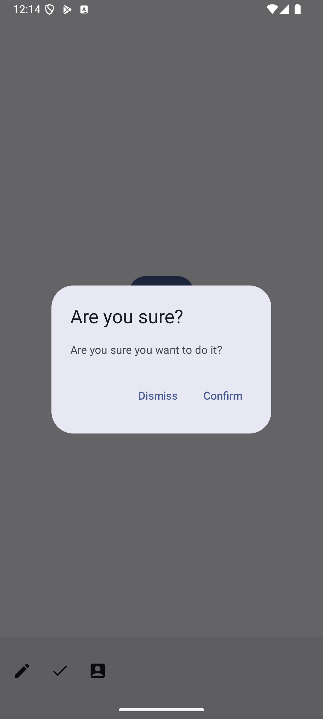
Here again is the specific code for the alert component:
AlertDialog(
    onDismissRequest = {
        openAlert.value = false
    },
    title = { Text(text = "Are you sure?") },
    text = { Text(text = "Are you sure you want to do it?") },
    confirmButton = {
        TextButton(onClick = {
            openAlert.value = false
            done.value = true
        }) { Text("Confirm") }
    },
    dismissButton = {
        TextButton(onClick = { openAlert.value = false }) { Text("Dismiss") }
    }
)
A simple alert has a title, some text, and a couple of buttons. As you can see here, the button logic both makes the alert go away, and in the case of the confirm button, also updates another key state variable in the screen.
Dialogs are more complex. The reason for this is that dialogs are used to gather additional information from the user beyond simply getting a yes/no response. This will require the use of additional user interface elements to collect that information. We typically set up dialogs by constructing our own components for the dialog - this is what I have done here. Here is the code for the custom dialog component I set up here:
@Composable
fun DialogWithChoice(
    choices: List<String>,
    onConfirmation: (String) -> Unit,
    onDismissRequest: () -> Unit
) {
    val selected = remember { mutableStateOf(choices[0]) }

    Dialog(onDismissRequest = { onDismissRequest() }) {
        Card(
            modifier = Modifier.padding(16.dp),
            shape = RoundedCornerShape(16.dp),
        ) {
            Column(
                modifier = Modifier,
                verticalArrangement = Arrangement.Center
            ) {
                Text(
                    text = "Make a selection",
                    modifier = Modifier.padding(16.dp),
                )
                choices.forEach { choice ->
                    Row(
                        Modifier.selectable(
                            selected = (choice == selected.value),
                            onClick = { selected.value = choice },
                            role = Role.RadioButton
                        )
                            .padding(horizontal = 16.dp),
                        verticalAlignment = Alignment.CenterVertically
                    ) {
                        RadioButton(
                            selected = (choice == selected.value),
                            onClick = null
                        )
                        Text(
                            text = choice,
                            style = MaterialTheme.typography.bodyMedium,
                            modifier = Modifier.padding(start = 16.dp)
                        )
                    }
                }
                Row(
                    modifier = Modifier
                        .fillMaxWidth(),
                    horizontalArrangement = Arrangement.Center,
                ) {
                    TextButton(
                        onClick = { onDismissRequest() },
                        modifier = Modifier.padding(8.dp),
                    ) {
                        Text("Dismiss")
                    }
                    TextButton(
                        onClick = { onConfirmation(selected.value) },
                        modifier = Modifier.padding(8.dp),
                    ) {
                        Text("Confirm")
                    }
                }
            }
        }
    }
}
The most important thing going on here is the use of the Dialog() component. That component has a body section where we set up the full user interface of the dialog. In this case, that is a Card() that contains everything we need, include a text prompt, a set of radio buttons to present options, and buttons at the bottom.
The dialog is linked to the "Change It!" button. When the user clicks that button we flip the state of the showDialog variable, which in turn causes the dialog to appear.
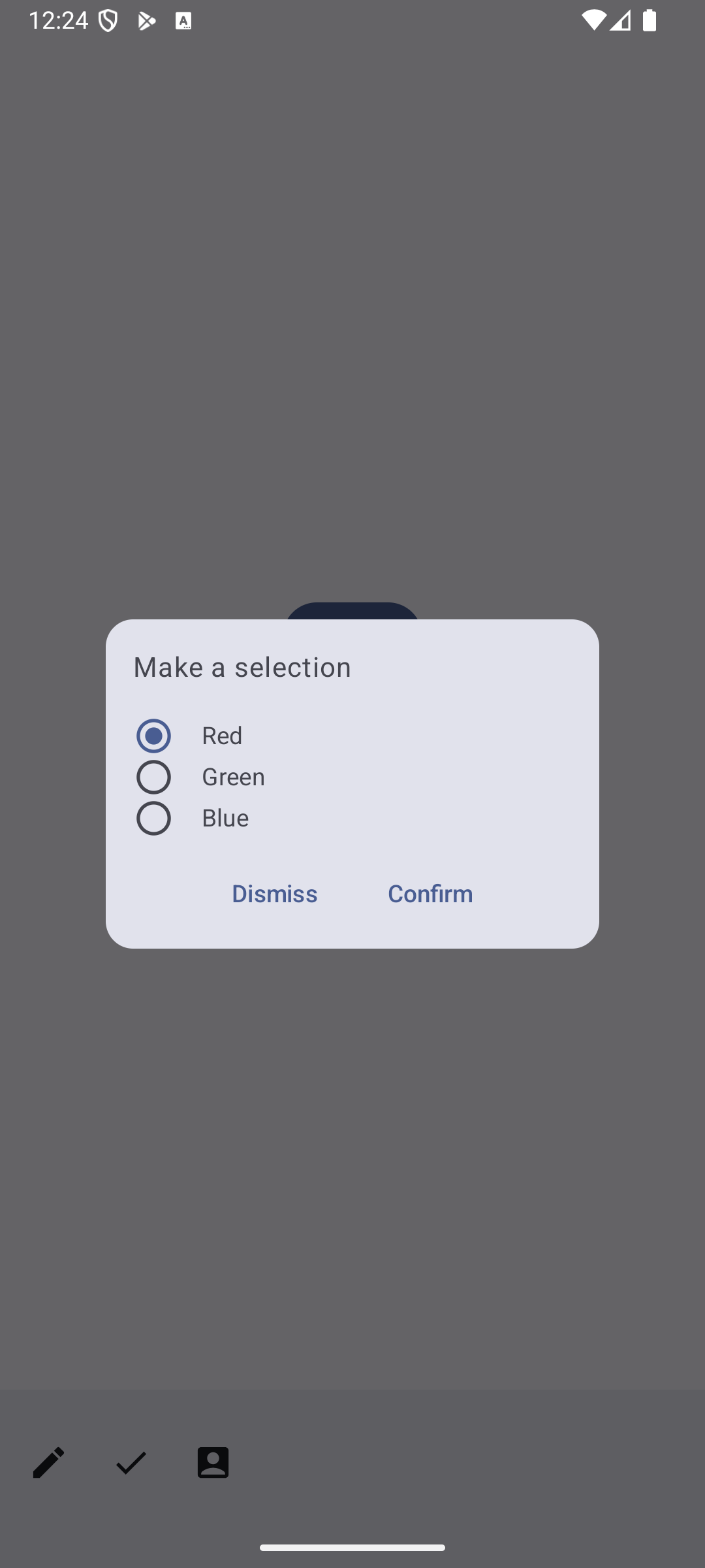
I have made an effort to make the code for the DialogWithChoice() component somewhat generic, so that you can potentially reuse this code in other settings. The function that defines the component takes three parameters: a list of Strings that lays out the options for the user to choose from, and two callbacks to invoke either when the user dismisses the dialog or makes a choice and confirms it. You can take a look at the code in the DialogScreen() that invokes this component to see how I make use of these three parameters. In particular, you should take a close look at how I set up the callback functions that I passed to DialogWithChoice().
Working with Photos
The final screen in the demo application demonstrates the use of a photo picker and an image to display a picture.
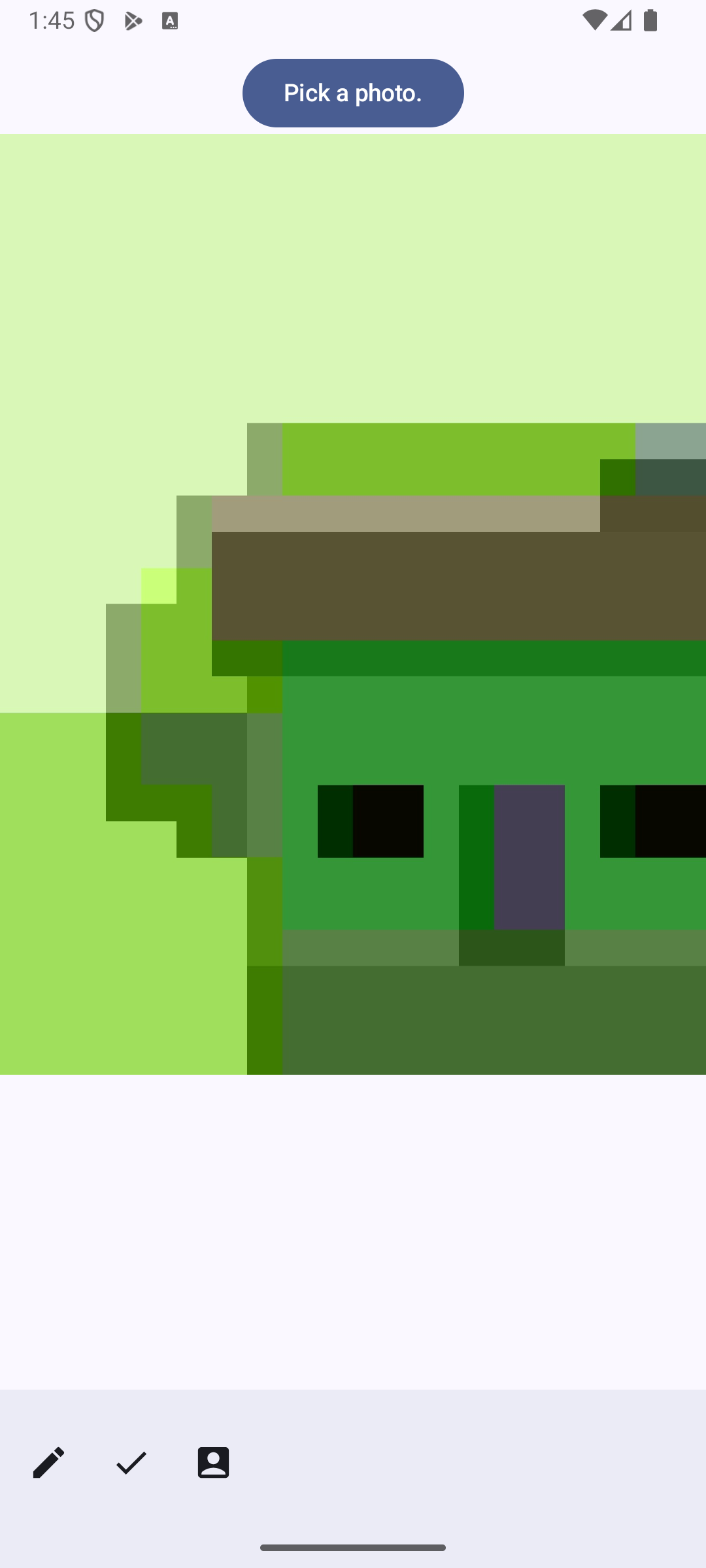
Here is the code for this screen:
@Composable
fun PhotoScreen(modifier : Modifier) {
    val selectedImage = remember { mutableStateOf<Uri?>(null) }

    val photoPickerLauncher = rememberLauncherForActivityResult(
        contract = ActivityResultContracts.PickVisualMedia(),
        onResult = { selectedImage.value = it }
    )

    fun launchPhotoPicker() {
        photoPickerLauncher.launch(
                PickVisualMediaRequest(ActivityResultContracts.PickVisualMedia.ImageOnly)
            )
    }

    Column(
        modifier = Modifier.fillMaxSize(),
        horizontalAlignment = Alignment.CenterHorizontally
    ) {
        Spacer(modifier = Modifier.height(30.dp))
        Button(onClick = {
            launchPhotoPicker()
        }) {
            Text("Pick a photo.")
        }

        if(selectedImage.value != null) {
            AsyncImage(
                model = selectedImage.value!!,
                contentDescription = null,
                modifier = Modifier.fillMaxWidth(),
                contentScale = ContentScale.Fit
            )
        }
    }
}
The two state variables and the function at the top of the component set up the necessary infrastructure for picking a photo. To pick a photo we use a launcher that gets stored in the photoPickerLauncher state variable. When we invoke the launcher and the user picks a photo to work with we will get back an optional Uri object, which points to the file where the selected image is stored.
To display the selected image we will make use of the AsyncImage() component. This component is not part of Jetpack Compose - it comes to us from the Coil library. To include the Coil library in our project we have to add this dependency:
implementation("io.coil-kt:coil-compose:2.5.0")
Information about more components
In this example I have tried to extend the set of components that you know about to give you additional tools for upcoming projects.
If you would like to learn more about the components that are available, I can recommend the composables.com web site, which has an overview of a large number of components that are available either as part of Jetpack Compose itself or the Material Library of additional components.