The More Components App
Our next example is an app that will demonstrate how to use a number of SwiftUI components that we have not had a chance to cover so far in this course.
Tabbed Navigation
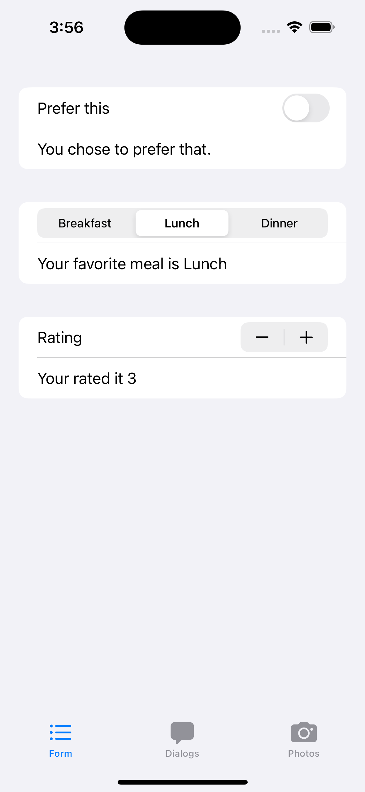
The first new feature that this app demonstrates is a new type of navigation using a tabbed interface. At the bottom of the app you will see a set of three icons - these allow us to navigate easily between three screens by simply tapping the icon for the screen we want.
This navigation structure gets set up in the ContentView for our app, which is the main view for the app:
struct ContentView: View {
    var body: some View {
        TabView {
            FormDemoView().tabItem {
                Label("Form",systemImage: "list.bullet")
            }
            DialogDemoView().tabItem {
                Label("Dialogs",systemImage: "bubble")
            }
            PhotosView().tabItem {
                Label("Photos",systemImage:"camera")
            }
        }
    }
}
The TabView component has content that lists the tabs that are available. Each tab is a view to go to modified by a tabItem that describes how to display it visually. In each case we use a Label() component to present the item. The systemImage parameter in the Label() constructor specifies what icon to use for the label.
SwiftUI comes equipped with set of over 6000 icons to choose from. The best way to see all of the available icons is to use the SF Symbols Mac application that Apple provides. To download this application go to developer.apple.com/sf-symbols.
The Form Demo
The first of the three screens in our example app demonstrates the use of the Form() component, along with some input components we haven't had a chance to work with.
Here is the code for that screen:
struct FormDemoView: View {
    @State var choseThis = false
    let meals = ["Breakfast","Lunch","Dinner"]
    @State var favoriteMeal = "Lunch"
    @State var rating = 3
    var body: some View {
        Form {
            Section {
                Toggle(isOn: $choseThis, label: {
                    Text("Prefer this")
                })
                if choseThis {
                    Text("You chose to prefer this.")
                } else {
                    Text("You chose to prefer that.")
                }
            }
            Section {
                Picker("Favorite meal",selection:$favoriteMeal) {
                    ForEach(meals,id:\.self) { meal in Text(meal) }
                }.pickerStyle(.segmented)
                Text("Your favorite meal is \(favoriteMeal)")
            }
            Section {
                Stepper("Rating",value: $rating,in: 1...5)
                Text("Your rated it \(rating)")
            }

        }
    }
}
A Form() is a list of Section() components. Each section gets displayed as a white rectangle with rounded border in front of the form's gray background. This creates a visual separation between the sections. The three sections here demonstrate the use of three new input elements, the Toggle(), the Picker(), and the Stepper(). In each case I have linked the input element to a state variable that the component will update.
Pickers come in a couple of different flavors. The style I used here is the segmented style, which displays all of the options at once. If you remove the .pickerStyle() modifier from the picker you will see the other style, which shows the user a pull-down menu of options to choose from.
A Stepper() allows a user to step up and down through a range of acceptable integer values. The range of allowed values is specified by the in: parameter in the constructor.
Working with Alerts and Dialogs
The second screen in the application demonstrates the use of an alert dialog and a sheet.
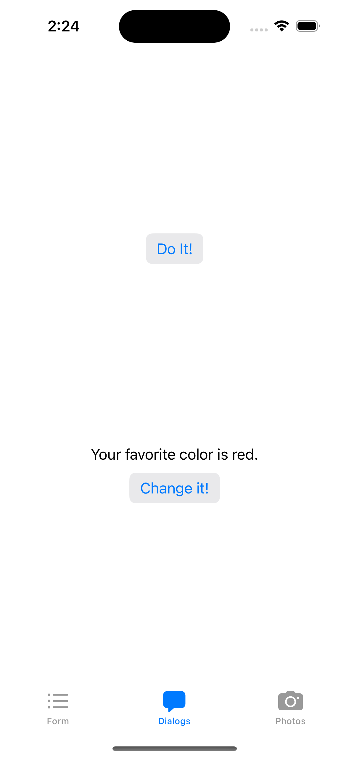
Both alerts and sheets are instances of modal dialogs. A modal dialog is a user interface element that pops up in response to some user action. While the dialog is visible the user is locked out from interacting with other user interface elements on the screen.
In this example I have tied an alert dialog and a sheet to a couple of the user interface elements. The first example is linking an alert dialog to the "Do It!" button. When the user clicks that button the alert will pop up and ask them to confirm that they truly intend to carry out this action.
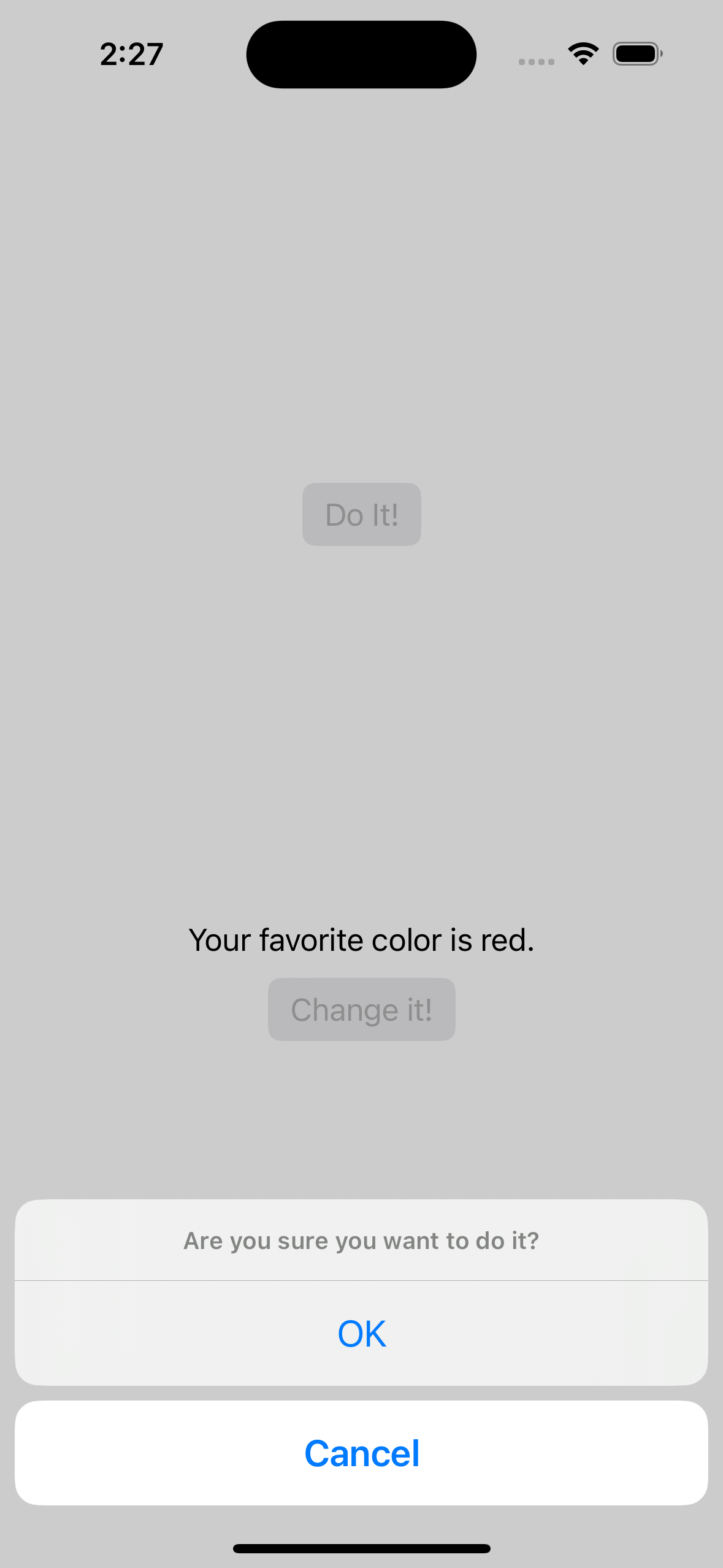
The alert gives the user a couple of buttons to click to either confirm the action or cancel it. Below when we look at that code we will see that it is relatively easy to add additional options to an alert to give the user a wider range of choices for what to do.
The sheet is linked to the "Change It!" button. When the user clicks that button the sheet will pop up and ask the user to provide additional information before proceding. Once again, a sheet is a type of modal interaction that forces the user to make a choice before doing anything else.
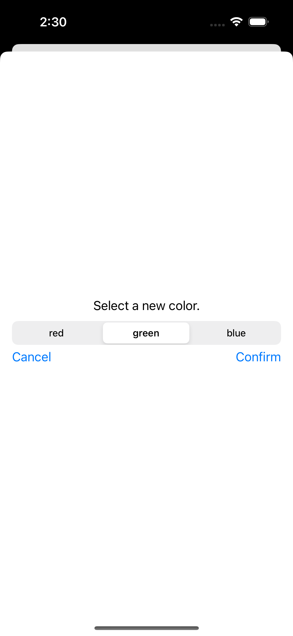
Sheets can include a virtually unlimited set of components to allow for fairly sophisticated scenarios. When we look at the code below we will see how this is done.
Here now is the code for the second screen:
struct DialogDemoView: View {
    @State var didIt = false
    @State var showConfirmation = false
    let colors = ["red","green","blue"]
    @State var favoriteColor = "red"
    @State var showSheet = false

    var body: some View {
        VStack {
            Spacer()
            if didIt == false {
                Button("Do It!") {
                    showConfirmation = true
                }.buttonStyle(.bordered)
                 .confirmationDialog("Confirm it", isPresented: $showConfirmation) {
                    Button("OK") { didIt = true }
                    Button("Cancel", role: .cancel) { }
                } message: {
                    Text("Are you sure you want to do it?")
                }
            } else {
                Text("You have done it.")
            }
            Spacer()
            Text("Your favorite color is \(favoriteColor).")
            Button("Change it!") { showSheet = true }
                .buttonStyle(.bordered)
                .sheet(isPresented: $showSheet) {
                    ColorSheet(choices:colors,selected:favoriteColor,finalChoice:$favoriteColor)
                }
            Spacer()
        }
    }
}
The first thing to focus on here is the code to implement the alert dialog. This is attached as a modifier to the "Do It!" button:
.confirmationDialog("Confirm it", isPresented: $showConfirmation) {
    Button("OK") { didIt = true }
    Button("Cancel", role: .cancel) { }
} message: {
    Text("Are you sure you want to do it?")
}
Because we are setting up an alert, the first thing we need to do is to set up logic that will determine when that alert should pop up on screen. In this example this is done by setting up a state variable showConfirmation and using that for the isPresented parameter for the confirmationDialog. If you look at the code for the "Do It!" button above you will see that the "Do It!" button flips that state variable to true, which in turn will cause the alert to appear.
The confirmation dialog has two sections where we set up the buttons that will be displayed and the text message the dialog will display. Clicking either of the two buttons will automatically cause the alert to be dismissed. Additionally, we can add logic to the buttons to do other things. In this case, clicking the OK button changes the value of another state variable. This in turn will change what the screen does.
The next thing to look at here is the code to generate the sheet. This is attached as a modifier to the "Change It!" button:
.sheet(isPresented: $showSheet) {                  ColorSheet(choices:colors,selected:favoriteColor,finalChoice:$favoriteColor)
}
The code here is similar to the alert. Once again we make use of a state variable, showSheet, to control whether or not the sheet should be displayed. The sheet() component also has a body, which can contain code to set up the components that will be displayed in the sheet. Since most sheets are more complex than simple confirmation dialogs the approach most programmers will take is to write a custom component for the entire sheet and then just invoke that component in the body of the sheet. This is the approach I used here. Here now is the code for the sheet body component:
struct ColorSheet : View {
    @Environment(\.dismiss) private var dismiss

    var choices : [String]
    @State var selected : String
    @Binding var finalChoice : String

    var body : some View {
        VStack {
            Text("Select a new color.")
            Picker("Favorite color",selection:$selected) {
                ForEach(choices,id:\.self) { choice in Text(choice) }
            }.pickerStyle(.segmented)
            HStack {
                Button("Cancel") {
                    dismiss()
                }
                Spacer()
                Button("Confirm") {
                    finalChoice = selected
                    dismiss()
                }
            }
        }.padding()
    }
}
In the body code you see here we set up all of the components that we want to appear on the sheet.
One unusual element here is the dismiss() function. You can see that being set up as an environment variable at the top of the component, which means that we are counting on the system to provide this function to us automatically when the sheet runs. As you can probably guess, the purpose of the dismiss() function is to make the sheet go away. We make sure to invoke that function in the code for both the "Confirm" button and the "Cancel" button.
Another subtle aspect of the code here is managing the interaction between the sheet and its parent screen. The reason I am displaying this sheet is to give the user a chance to update one of the state variables in the screen, the favoriteColor variable. We will give the sheet access to that state variable via a binding, finalChoice. When I invoke the ColorSheet component I pass it a reference to the favoriteColor state variable and link that to the finalChoice binding variable. Since finalChoice is a binding, updating it will automatically update the favoriteColor state variable it is bound to.
Working with Photos
The third screen in our example app gives the user the opportunity to select a photo from their photo library.
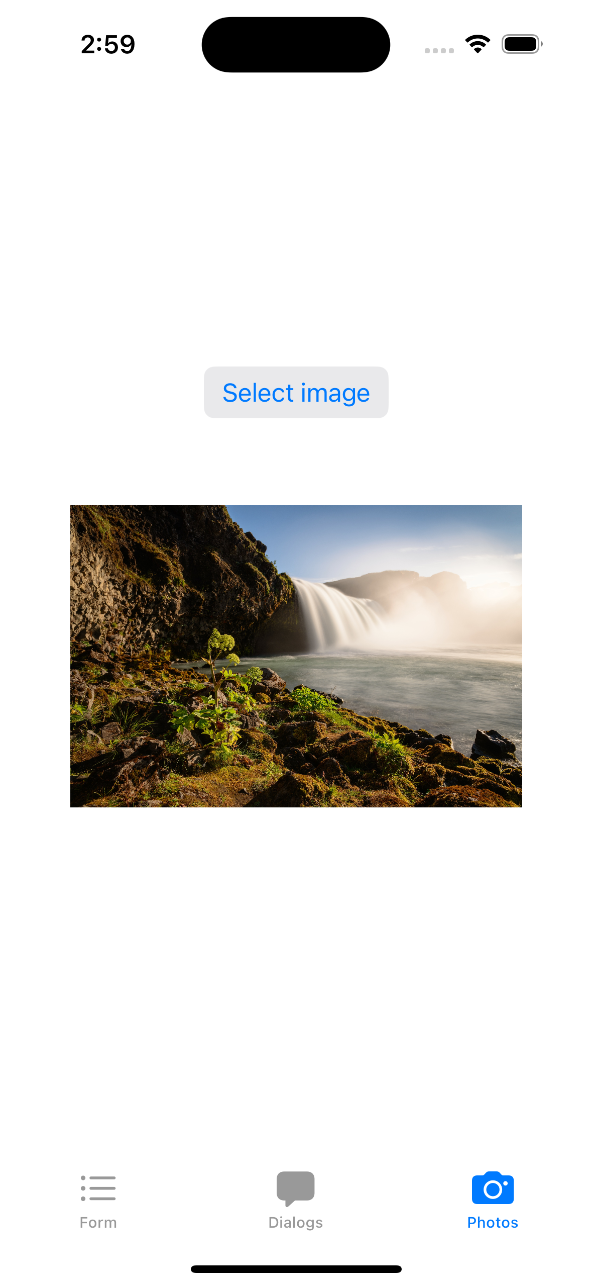
Clicking the "Select image" button brings up a photo picker dialog that allows the user to select a photo from their library.
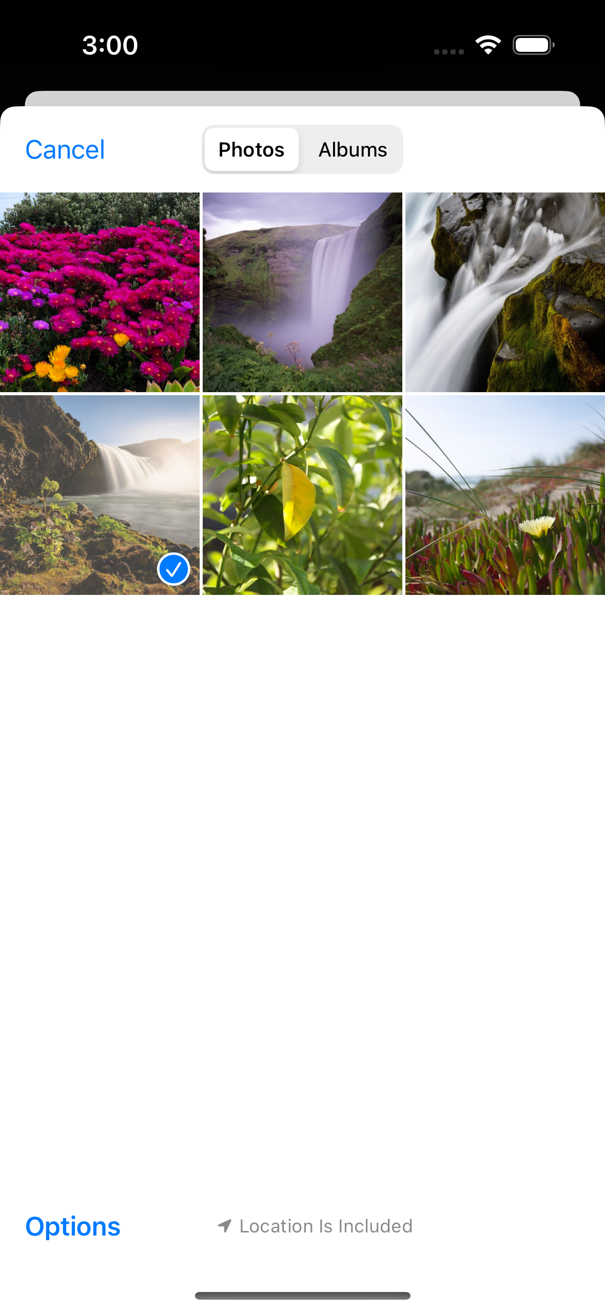
Once the user has selected a photo that photo will appear on the screen.
Here now is the code for this screen.
struct PhotosView: View {
    @State private var selectedItem: PhotosPickerItem?
    @State private var selectedImage: Image?

    var body: some View {
        VStack {
            Spacer()
            PhotosPicker("Select image", selection: $selectedItem, matching: .images)
                .buttonStyle(.bordered)

            if let image = selectedImage {
                image.resizable()
                    .scaledToFit()
                    .frame(width: 300, height: 300)
                Spacer()
            } else {
                Spacer()
                Image(systemName:"person").resizable().frame(width: 150,height: 150)
                Spacer()
            }
        }
        .onChange(of: selectedItem) {
            Task {
                if let loaded = try? await selectedItem?.loadTransferable(type: Image.self) {
                    selectedImage = loaded
                }
            }
        }
    }
}
The thing that looks like a "Select image" button is actually a PhotosPicker() component. Clicking it brings up a sheet that prompts the user to select an image. Information about the image that the user selects will get stored in the selectedItem state variable.
The other key piece here is a change listener that will get triggered when the selectedItem state variable gets updated.
.onChange(of: selectedItem) {
    Task {
        if let loaded = try? await selectedItem?.loadTransferable(type: Image.self) {
            selectedImage = loaded
        }
     }
}
When the user has selected an item we run a background task that loads the selected image and stores it in the selectedImage state variable.