Introducing matplotlib and pyplot
The Anaconda Python distribution that we are using in this tutorial comes with a large number of useful Python packages. One of these is matplotlib, which is a library for constructing plots. One module within this larger library is pyplot, which presents a simple and easy to use interface for constructing plots.
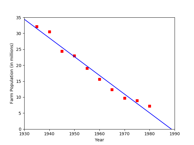
For our first pyplot example I will be building on the linear regression example from the last lecture. This time around I want to compute the regression line and then use pyplot to plot both the raw data points and the regression line.
Here is the complete source code for that example. Below I will break this down and cover some specific aspects of using pyplot.
import matplotlib.pyplot as plt

def readData(fileName):
    """Generic data reading function:
    reads lines in a text file and splits them into lists"""
    data = []
    with open(fileName) as f:
        for line in f.readlines():
            data.append(line.split())
    return data

def cleanLine(line):
    """Converts a raw line list into an appropriate data format."""
    return (int(line[0]),float(line[1]))

def means(pairs):
    xSum = 0
    ySum = 0
    for x,y in pairs:
        xSum += x
        ySum += y
    N = len(pairs)
    return (xSum/N,ySum/N)

def covariance(pairs,means):
    sum = 0
    for x,y in pairs:
      sum += (x-means[0])*(y-means[1])
    return sum

def xVariance(pairs,xMean):
    sum = 0
    for x,y in pairs:
        sum += (x-xMean)*(x-xMean)
    return sum

def regressionCoeffs(pairs):
    """Computes linear regression coefficients (a,b) from a list of (x,y) pairs."""
    m = means(pairs)
    beta = covariance(pairs,m)/xVariance(pairs,m[0])
    alpha = m[1]-beta*m[0]
    return (alpha,beta)

rawData = readData("farm.txt")
pairs = [cleanLine(line) for line in rawData]
a,b = regressionCoeffs(pairs)

# pyplot expects the data to be plotted to be in the form
# of a list of x values and a list of y values.
# Reconfigure the data to suit pyplot.
x = [year for year,pop in rawData]
y = [pop for year,pop in rawData]
s = [1930,1990]
t = [a+b*1930,a+b*1990]
# Now plot the data sequence and the regression line
plt.plot(x,y,'rs',s,t,'b-')
# Set the axis details
plt.axis([1930,1990,0,35])
plt.xlabel("Year")
plt.ylabel("Farm Population (in millions)")
plt.show()
Basics of pyplot
To use pyplot we start with an import statement.
import matplotlib.pyplot as plt
matplotlib is part of the Anaconda distribution, so you should already have matplotlib installed.
The first and most important method in pyplot is the plot() method, which plots a set of data points. plot() expects the data points to be provided as a list of x-values and a separate list of y-values. If your data is not organized in that way you will have to write a little code to reorganize it. In this example the data that we read from the file gets stored as a list of (x,y) tuples, so we have to start with some code to build separate x and y lists from that data:
x = [year for year,pop in rawData]
y = [pop for year,pop in rawData]
To plot the regression line we simply construct a data series consisting of a couple of points, the endpoints of the line we seek to plot:
s = [1930,1990]
t = [a+b*1930,a+b*1990]
The plot() command can plot one or more data series. After each series we also need to provide a format string to specify how we want the series plotted:
plt.plot(x,y,'rs',s,t,'b-')
The format string consists of two characters, a color and a plot style. Here is a table of the color values available and their letter codes:
| color | code |
|---|---|
| blue | b |
| green | g |
| red | r |
| cyan | c |
| magenta | m |
| yellow | y |
| black | k |
| white | w |
Here is a table of some of the plot styles available:
| style | code |
|---|---|
| line | - |
| dotted line | : |
| point | . |
| circle | o |
| square | s |
The plot example we used above will plot the data sequence using red squares and the regression line as a blue line.
After setting up the plot you will usually also want to set up the axes and label them. These commands do that.
plt.axis([1930,1990,0,35])
plt.xlabel("Year")
plt.ylabel("Farm Population (in millions)")
The axis() method takes a list that gives the start and end values for the x axis followed by the start and end values for the y axis.
The last step in plotting is telling pyplot to show the plot.
plt.show()
This will open a graphics window that displays the plot. The graphics window provides controls that will allow you to edit or save the image. Here is the plot generated by this example program.

You can also ask pyplot to save the plot in an image file:
plt.save('farm.png')
This will save the image file in the same directory as the Python program's source code file.